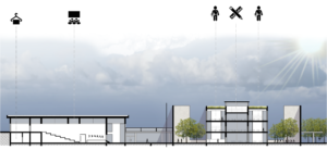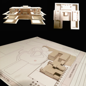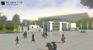
We were asked to design a school on a public square in Villeneuve-la-Garenne neighborhood. Like others dormitory towns, the area is noticeable with more blocks of flats than public facilities. The spatial composition includes an elementary school and some public amenities, like a stadium and an auditorium. After an analysis of iconic institutions (like the First Unitarian Church of Rochester), the design project appropriates Louis Kahn notions about light and space.
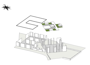
We explore the possibility of combining different construction elements, like structure and thickness. Louis Kahn elaborated the distinction between served and servant spaces, «… with great central living halls and auxiliary spaces nestled into thick outside walls ».
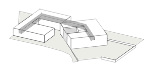
We articulate both buildings with a suspended bridge.
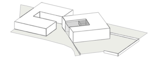
We reinforce the interior space by revolving one of the constructions.
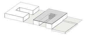
With a reverse gesture, we create an interiority feel and an opening on nature by turning the building back to the street.
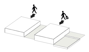
The first massing is restrained for students and the second one is available to the community. We start by drawing two squares and we search reasons to discredit them. «I use the square to begin my solutions because the square is a non-choice, really. » Louis Kahn
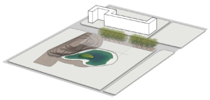
To make a statement, the new building faces the residence from the 70s. The dichotomy features oppose postmodern construction versus brutalist architecture.
The first volume includes a gym, locker rooms and a multipurpose hall that can be used as a conference or performance room. The building has an entrance of its own on the main street upper level. The gap between the street level and the natural topography allows different access.
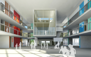
The second volume is reserved for students. The building circulation surrounds an atrium open to the outside by a curtain wall on the West side. To suggest new learning methods, classrooms are modular and can be coupled with workshops where students can work together.
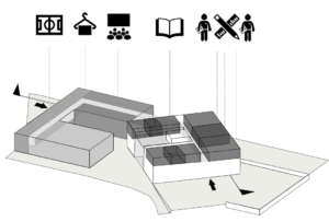
To explore Louis Kahn’s notions, structural systems are used to be a part of the interior design. We build storage, shelves and benches in the wall thickness. The school main space is the library, like a metaphor where knowledge is the place’s identity. It’s a glass box suspended from the ceiling that contrast with the building’s robustness.
To allow light to penetrate the monolith wideness, we open two patios at the building corners. In a sustainable concern, we preserve a maximum of the existing trees. To play with light again, roofs are raised above the workshops and circulation areas, to provide indirect light. The project benefits from the duality between transparency and opacity.
